Aug 3, 2016

Legendy - Vodník

Photoshop
So I've been working on this personal project for awhile now. It originally started as a game idea (still hoping for it to happen one day) which revolves around Czech legends. There are many legends that are connected to different places around the Czech Republic and when I was reading this book about Prague legends to see if there would be enough characters for my game, I felt like I was reading little stories from some RPG game. So many great characters! The problem was that I never liked the way they were portrayed and illustrated. Lots of them are supposed to be scary but they are not even a bit.
Look at the character "Vodník" for example. According to one legend, he is supposed to be a fallen angel who fell from a sky right into the river. Another legend states that he is a corpse brought to life when the cemetery flooded and holy water got washed away from his body (my favorite version :-). Also, he is a dude who is supposed to live in rivers and ponds, drown people, and take their souls.  He then keeps the souls in some sort of jars, hidden under water. He can shape shift into different animals or objects. Damn! That's what I call a scary character right from some video game.
Most of the illustrations portray this "creature" in a very old fashioned way which I don't find scary at all. If this guy came to my house to watch my kids while I was gone, I don't think I would feel concerned. Well okay, maybe a little, but the point is, most of the illustrations are for little children. The same goes for the illustrations of other Czech legends...so I decided to give them a small makeover. More legends are coming soon.


Jul 20, 2016

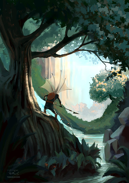
Wild Thing

Photoshop


I'm back with a new piece and I thought it would be nice to share a little bit from the creation process.

The process


Unfortunatelly I haven't saved the early stages of this painting because this wasn't really meant to be a finished painting. I was just going to test new brushes I got from Sergey Koleshov's art blog (check out his artworks, he's an awesome artist. Also thanks Sergey for the brushes).
Anyway, so I just started to make shapes with all different brushes to see what those bushes do.
After a while I actually started to paint something concrete. So I decided to push it more towards finished piece.


I started to build up the composition. The idea was that I'm painting some tribal wild guy looking out of some jungle or forest.I established the light and colorful background with some tall red rocks going really up high. Contrast to this was supposed to be the green and bit desaturated forest.
I also added a creek so it creates more interesting composition by splitting the left and right side of the foreground. It also creates a light background to the lower half of the dark figure and makes it stand out more.


Here I made the foreground tree area darker so there is more contrast with the background. I also adjusted the pose of the figure and rotated it a bit so it has a better looking stance. I added some red flower thingies into the green area in the foreground. The last thing I did that I added some dark big leaves to the very foreground just to give the picture more three dimensional feel.


Things were still looking boring. I was ok with the composition but the colors and lighting were still far from great so I started to play a bit more in the midground area and the background. The main change here was that I made the green area behind the figure warm green and also I made the background colors more saturated. I also started to change the shape of the trunk of the tree because I didn't like it.


Still not good enough. I needed more. I added some reflected warm light to figure, making it stand out more and I also started to give more vibrant texture to the tree by adding red color with texturer brush. But something was still missing.


 Finaly, I figured out the missing piece and no, it wasn't the shield of the figure's back. It needed the srong light hitting the right side of the tree trunk. It added a lot of missing visual interest and contrast to the picture. From now on, the key stones of the picture were established and I could move onto detailing and refining the shapes.


I felt like the middle ground is kind of empty so I added a tree illuminated from the top right by the low positioned sun. Also I made some trees in the back. I made them barely visible by adding a lot of atmospheric perspective to it. I also refined the figure just a bit and the water in the foreground.


I still felt that the figure was a bit boring so I wanted to add some extra things to it. I did. I'm not exactly sure what it is for, but maybe it is a net for catching insects while the creature runs trough the forest. Or maybe, it is for fishing. I don't know. In this stage I also refined the grass in the midground a bit.


This stage is not very different from the previous one. I just used the color balance to make the scene warmer, which later I realized, that it actually kills the warm background vs. cool foreground effect, so I took it away and went back to the previous color setup. I also added some fish jumping out of the water and going up the stream (like salmon) to give the scene more life and the creature some purpose. Yeah, he/she is fishing now!


In this final step, I changed the way the creature is holding the spear and made it looking more like a spear. I also worked on refining the tree and the tree leaves on top right.
And I decided to call it finished. Hooray! Next please!

Jun 27, 2016

The Last Giant

This is one of the illustrations from my personal project "Legends".
Photoshop

Jun 5, 2016

Quick sketch #1

Charcoal pencil on smooth newsprint
Quick sketch is definitely one of my favorite things to do. My schedule these days doesn't really allow me to attend live figure drawing classes, so whenever I can, I use these great figure drawing resources from New Masters Academy's YouTube channel. There is also another great channel called Croquis Cafe.
I'm still not very fast at quick sketching. I often just pause the video and try to work on the pose longer than 5 or 10 minutes, just so I can focus more on understanding the anatomy and form. But since this is supposed to be quick sketching, I never go over 30 minutes for a single pose.
I'm still pretty slow though, and I might never be as fast as others, but hey, I want to enjoy the process. That, I feel, is the most important thing about drawing or painting.

May 31, 2016

Serpent Dragon in the Abyss

Photoshop
This must be my first dragon painting ever. I did some drawings before but only after I realized I needed a dragon painting for my portfolio I decided to make one.
I used this sketch, I did earlier in ink, as a base for my painting.


But I didn't sticked to it too closely. I liked the composition and values so that's what I took from the original sketch.
The background is very blury and not defined which is one of the things I like about loose sketches especially the ones done in ink or watercolors. You get these random effects and shapes which can spark your imagination later and these random shapes can turn into something you would otherwise not thought of. Or you can leave them abstract and let the viewer decide what they are.
In this case I thought it would look nice if the scene took place in the deep dark abyss.

Here are all the stages of the painting. From ugly to finish. Enjoy. [Click to enlarge]

When I'm working with a sketch on the paper, I scan it to Photoshop and put on a separate layer set to multiply. Then I create another layer below the sketch and start painting in color. At this stage I try to experiment because it's still a sketching stage.
In this case I choose two primary light sources. One cool blue light from above and the other is a fire (warm yellow) from the dragon. This created a nice cool vs. warm color scheme.
I also added some fallen trees in the background to make the place look more like a place where this dragon would live. To give it the sense of depth I used lots of atmospheric perspective in the background which gives the idea that the place is really wet and humid kind of like a swamp.
As you can see I changed the dragon's head because I didn't like the the way it was looking. I wanted more interesting angle. Another think I changed was the knight. Original idea was, that he is taking cover behind the shield but later I thought it would look better if I made him in more of a dynamic pose, like if he is jumping away from the flame.

At the end I re-cropped the image for better composition. I usually like to keep the rule of thirds  in mind when designing or adjusting the composition. I also did some color adjustments at the end, using color balance although this time I didn't have to adjust as much because I was pretty close with my color choice at the beginning. Sometime I'm not as lucky and then this thing turns into a recoloring mess with lot of time wasted on recoloring. So make sure to get the color as close as to what it should be, right from the beginning.


Apr 27, 2016

Wolf

This is a marker drawing I did a while ago. It was a series of wild animal illustration for my personal project.
Copic markers

More goblins here!

This is a preliminary for a painting I'm going to work on.
 Staedtler AllXWrite HB, Palomino Blackwing and small correction in Photoshop